How and why the Wagtail page editor is evolving
See how the choices we made in our page editor upgrades have led to an improved editor experience

A page editor is the heart of a content management system (CMS). As a designer, I know just how important it is to have tools that make it easier for creativity to flow rather than getting in the way. That's why I was excited, and maybe a bit nervous, when Google helped us fund an update of the Wagtail page editor.
A lot of work went into redesigning the page editor. So much that I wish I had kept a journal of all the different things we tried. As I went back through my notes and thought about everything we did to improve the page editor, these were the parts of that journey that stood out to me.
A vision, big ambitions, and some problems to solve
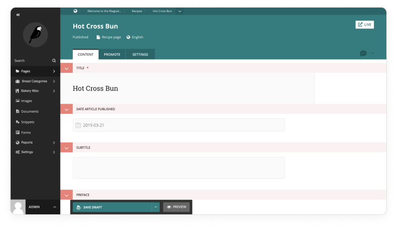
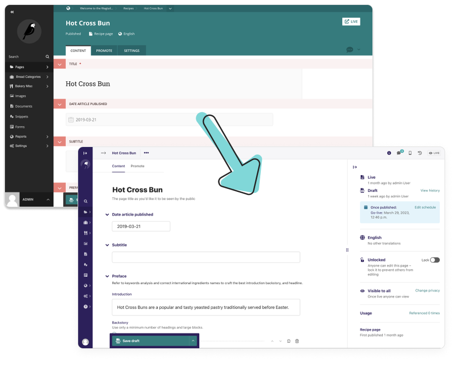
We decided at the beginning of this journey that our vision was for “Editors to get their best work done.” What you see above is the page editor we started with. We added a lot of improvements iteratively over time, like workflows and commenting, that editors really appreciated. But those features also created some inconsistencies in the user interface and presented some challenges for accessibility we wanted to address. There were also some less-than-optimal user experiences we wanted to fix, such as the huge amount of scrolling editors had to do when working with long pieces of content. We decided that if we wanted to create the best experience for editors we needed to take a more holistic approach.
How we simplified the user interface
We made several changes in an effort to reduce the “visual noise” on the page and provide editors with a workspace that felt a little cleaner.
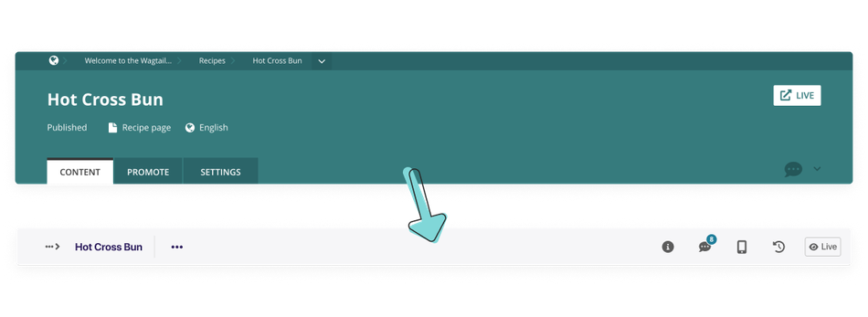
A lightweight header
As you can see here, the older header took up a lot of space. When Wagtail 4.0 was released, we gave users the option to toggle on a slimmer version of the sidebar. Since that worked so well, we thought a slimmer version of the editor would work well for users too.
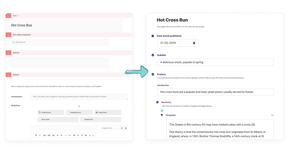
A pared back editing interface
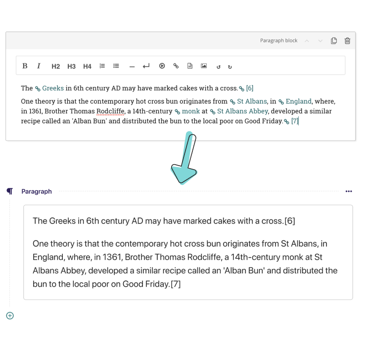
As we explored how to simplify the editing interface, we looked to other applications like Dropbox Paper, Notion, and Wordpress Gutenberg for inspiration. They all offer very pleasant writing experiences, and we wanted to offer something similar in Wagtail. We shifted as much focus as we could away from labels and UI scaffolding to the content. We decided not to remove all labels entirely, like some of those other applications do, because labels are important for helping people who use screen readers and keyboard navigation to get around the page.
A hidden rich text toolbar
Our old Draftail toolbar was an unintuitive combination of text formatting and element insertion, and we wanted to make a clearer distinction between those two tasks. By making the toolbar hideable, people could also have more control over their workspace.
We received a lot of feedback from the community about the toolbar when we initially rolled it out. There were some very valid points about why leaving the toolbar visible was a valuable thing. So we added a pinning function to the toolbar, which now gives people the choice to keep the toolbar visible or stow it away.
A purposeful use of colour
As we updated the colour scheme for Wagtail, we decided to use our traditional teal colour more sparingly and to use it to indicate action-oriented items like buttons or links. We also used indigo for UI labels and dark greys for the content boxes to help content creators scan their work more easily and find what they need.
Speeding up content production
We definitely wanted the new Wagtail editor to help people be more productive. As we went through different designs, we sought out as many opportunities as we could to help save people time. These are some of the changes we made to help people be more efficient and create content faster.
Improvements to the StreamField UI
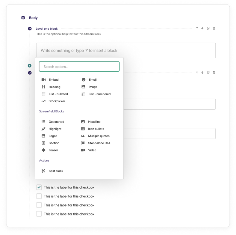
StreamField is one of the best features of Wagtail. People love StreamField, but there were definitely some opportunities to make StreamField an even better experience. For example, many people found navigating StreamFields with nested blocks more difficult than it needed to be. We added dashed guidelines to help editors orient themselves when navigating through a lot of nested blocks, and we reduced the indentation to provide more consistent spacing and save space in nested blocks.
One other important thing we added is an accessible fly-out block chooser that makes it simpler for people to pick the blocks they need as they go. Formatting options, blocks, and actions are all grouped together to help editors get to what they need more quickly.
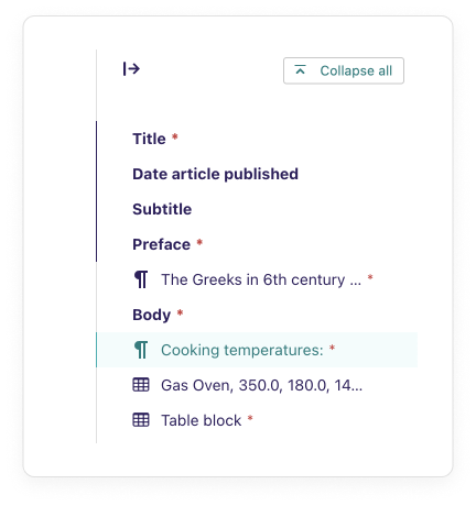
Collapsing content and the minimap
One pretty consistent opinion we got from users was that longer pages were taking too long to scroll through. In the new design, we made all the sections collapsible and also added a “Collapse All” keyboard command so whole pages could be collapsed down at once.
We added a minimap too so that people could find important bits of their content more easily and locate validation errors without having to hop around the page as much.
Live previews
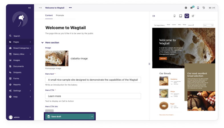
One of our absolute favourite changes was adding a live preview to the editor. Now people can see how their content looks side-by-side while they write it. They can also see how it displays on different devices, which is super handy when you have a graphic that might work great on mobile but not so well on a desktop. With the live preview, content creators can spot issues sooner and fix them.
Some final thoughts
I hope you enjoyed this little tour of our page editor redesign and my recollection of our “greatest hits” from the design process. If you haven't had a chance to experience the new editor yourself, please do give it a try.
There are so many people to thank for making this happen both inside and outside Torchbox as well as the Wagtail community. We definitely do want to give another huge shoutout to Google for sponsoring this redesign. Their sponsorship helped us give the Wagtail page editor the love it truly deserved. And there are many other features and new designs that we're hoping sponsors can help us bring to life. If you're interested in making them happen, please do give my colleague Ian Bellchambers a shout if you can help us out.
Copy and editing for this article were provided by Meagen Voss.